it’s all in the details
one of the most rewarding parts of this project has been layering in original details across every watch. It’s been a long process, but deeply fulfilling
below are a few design elements you might not catch at first glance. Each watch represents over twenty years of watch design experience, and serves as a platform to share my personal passion for this industry
everything you see (apart from the movement) was created from scratch, no off-the-shelf components, nothing borrowed. Every element is unique to this brand, made specifically for this project
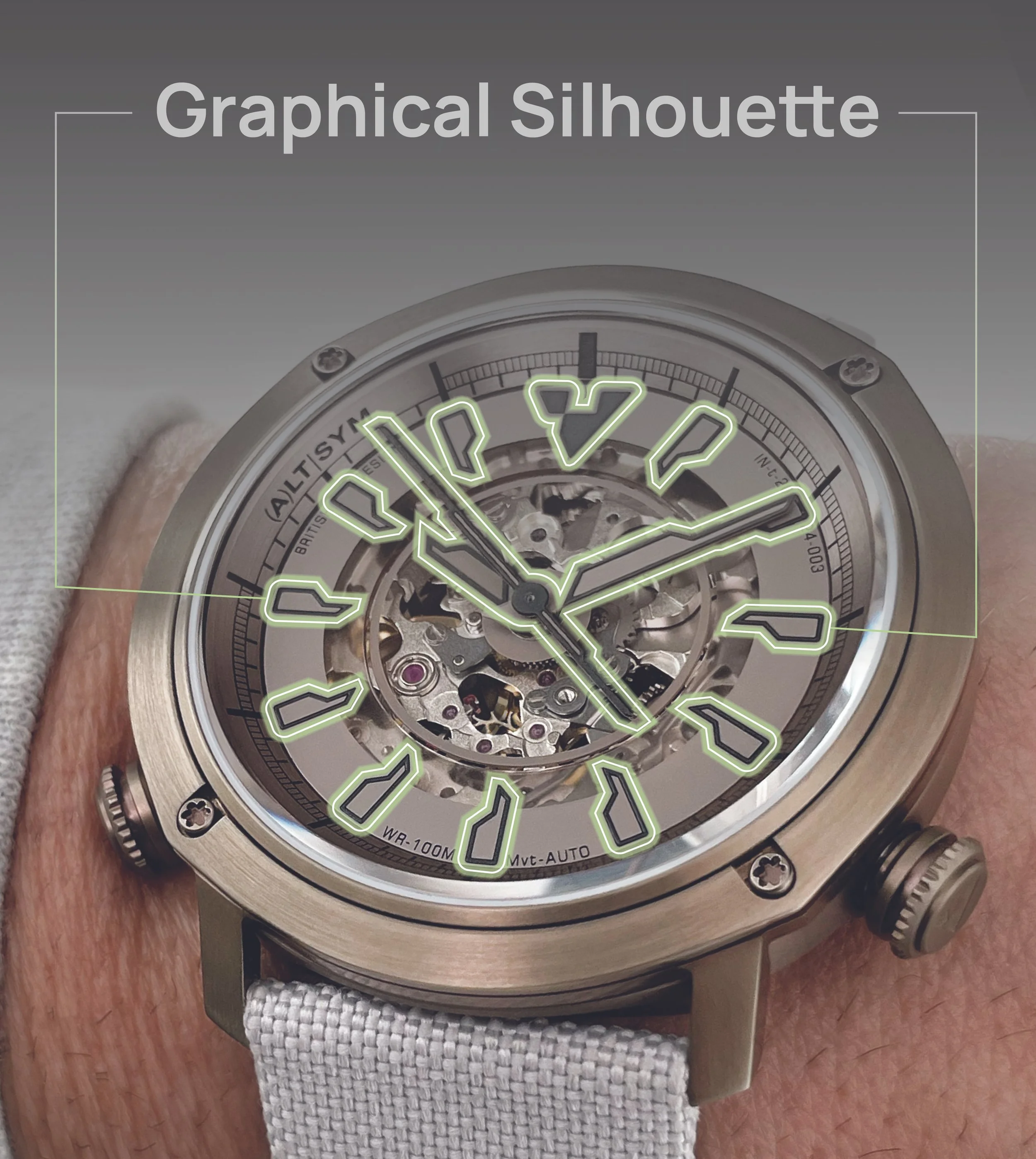
graphic silhouette
as we move ahead, this unique dial and hand silhouette will establish a powerful identity for all future designs, firmly embedding itself in the DNA of ALTERNATIVE SYMMETRY. Our approach will embrace creativity, allowing designs to evolve both within and beyond this signature shape. This ongoing exploration ensures that we maintain a strong and authentic identity that reflects our brand’s vision

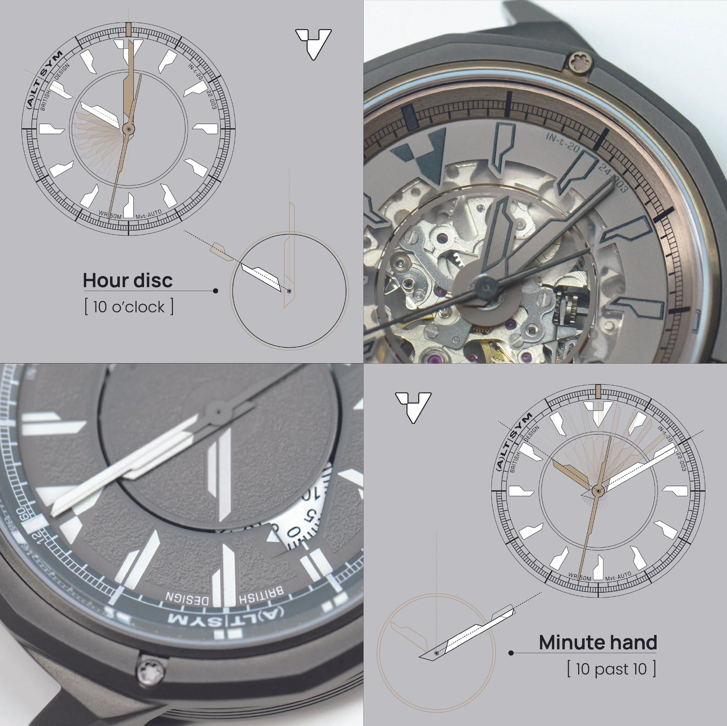
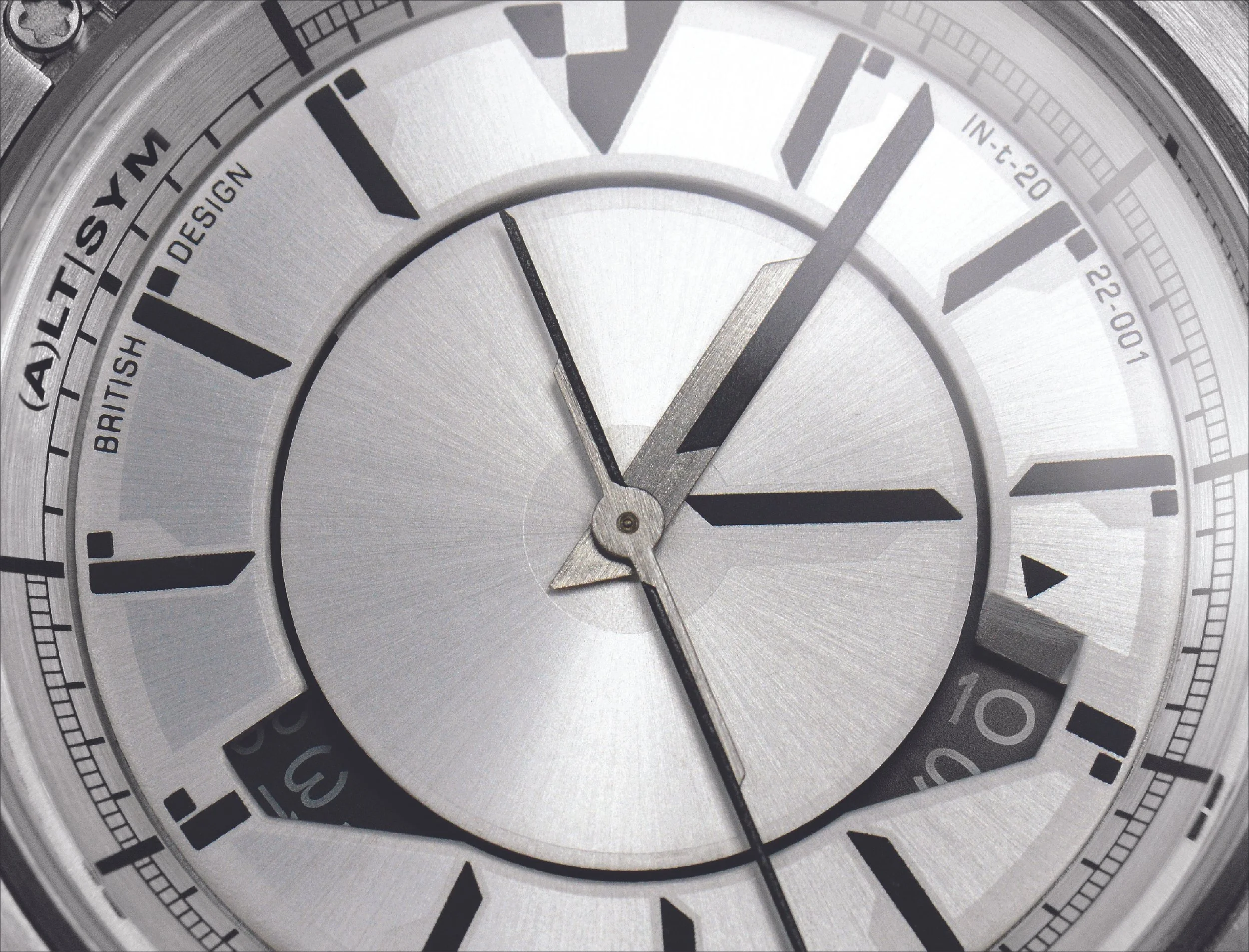
indice hand/disk harmony
reading time is crucial—after all, these are watches. Our new dial language prioritizes precision in timekeeping. The diagram below showcases how the unique shape of the indices harmonizes with the asymmetrical hands, offering a clear and intuitive way to tell time
the hour disc employs a blend of points and lines to align with the indices, presenting a graphic form of accuracy as it moves past each hour. In contrast, the minute hand features the same asymmetrical design reversed, longer to reach the indices, following the markings for every five minutes. The inner bezel elegantly tracks both minutes and seconds in this fluid motion
as the hour and minute hands overlap, they share the same silhouette that enhances the iconic design. The second-hand features a slimmer shape with an extended balance that rotates smoothly around the edge of the hour disc, achieving balance and dynamism
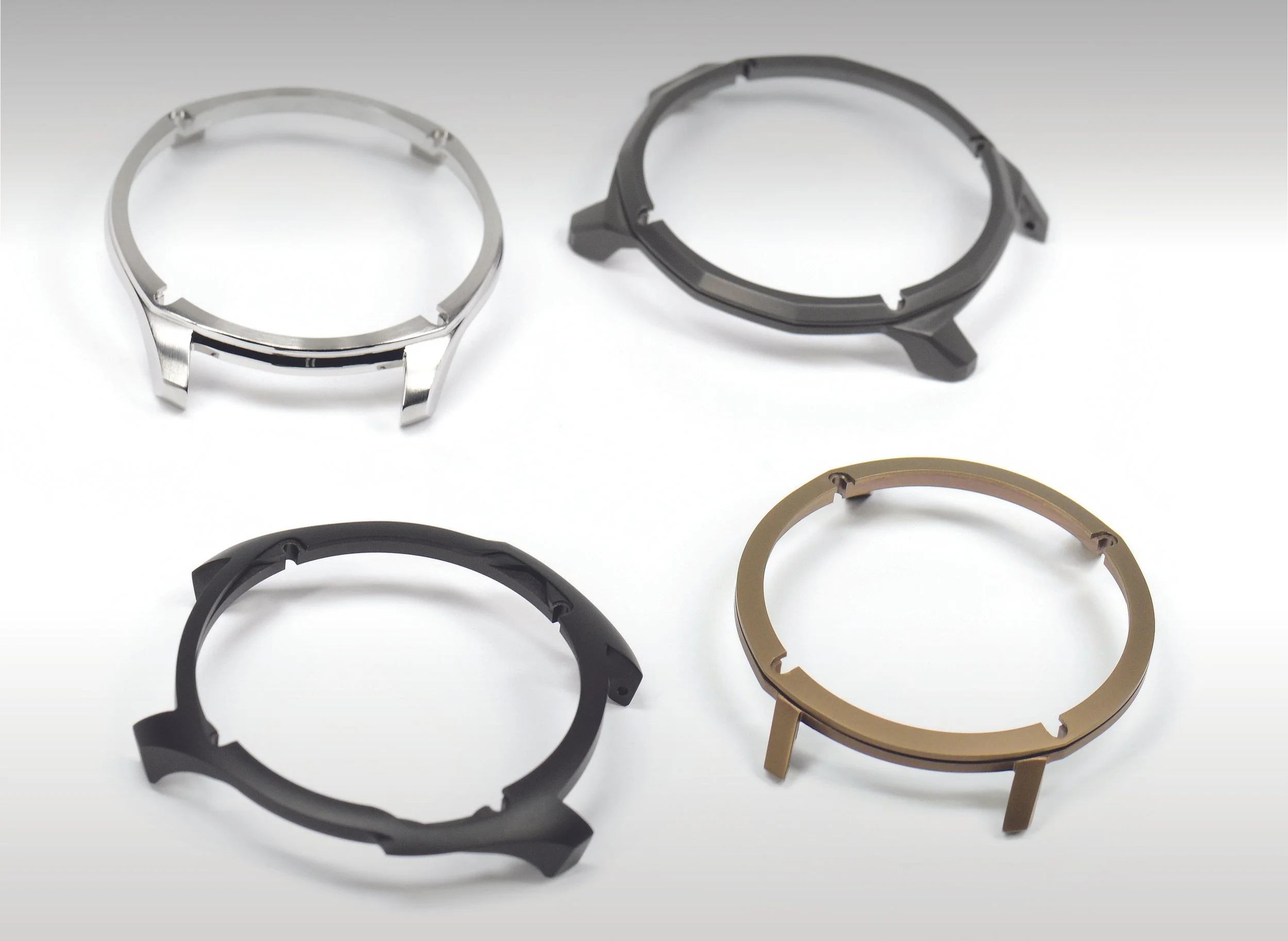
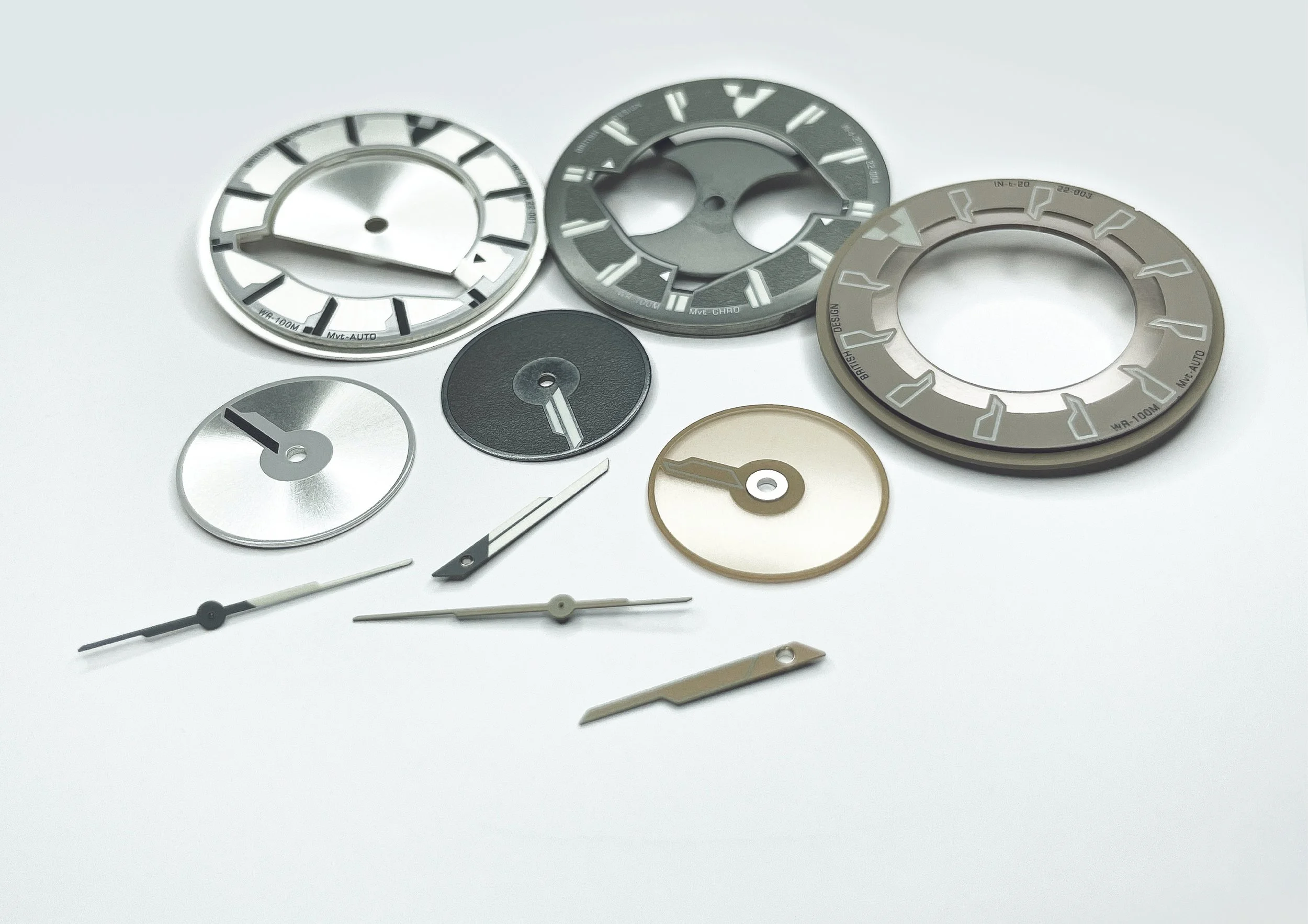
SURFACE’s
these have been shown and talked in depth previously, but seeing all four together really highlights the detail and how distinct each shape is. Separated, the SURFACE’s reveal just how intricate the design work is. The multi-part construction seriously levels up the form, far beyond what you get with a conventional single-piece watch case
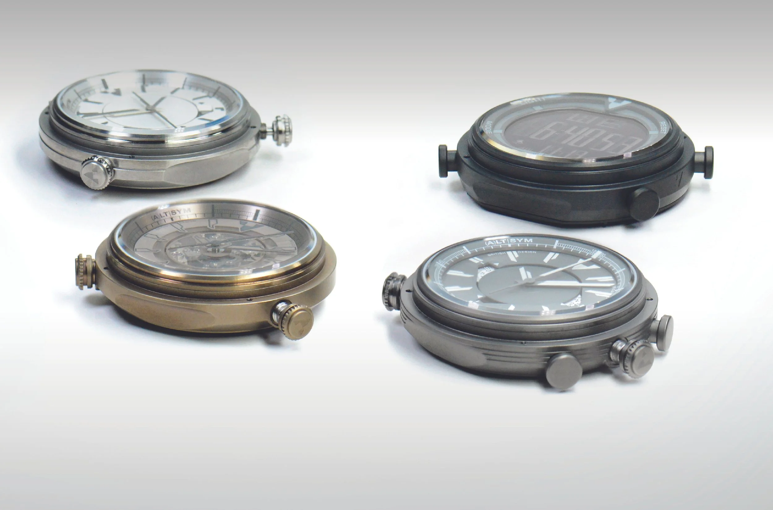
MODULE’s
crafted from recycled steel, just like the SURFACE’s, adding to the sustainability side. Each MODULE case is different, and that’s the plan going forward. The launch collection includes around the circumference a logo, a single line, a multi-line, and a super clean minimalist case for those who want that look. Because it’s a separate component, you can keep your watch pristine and still refresh the aesthetic whenever you want
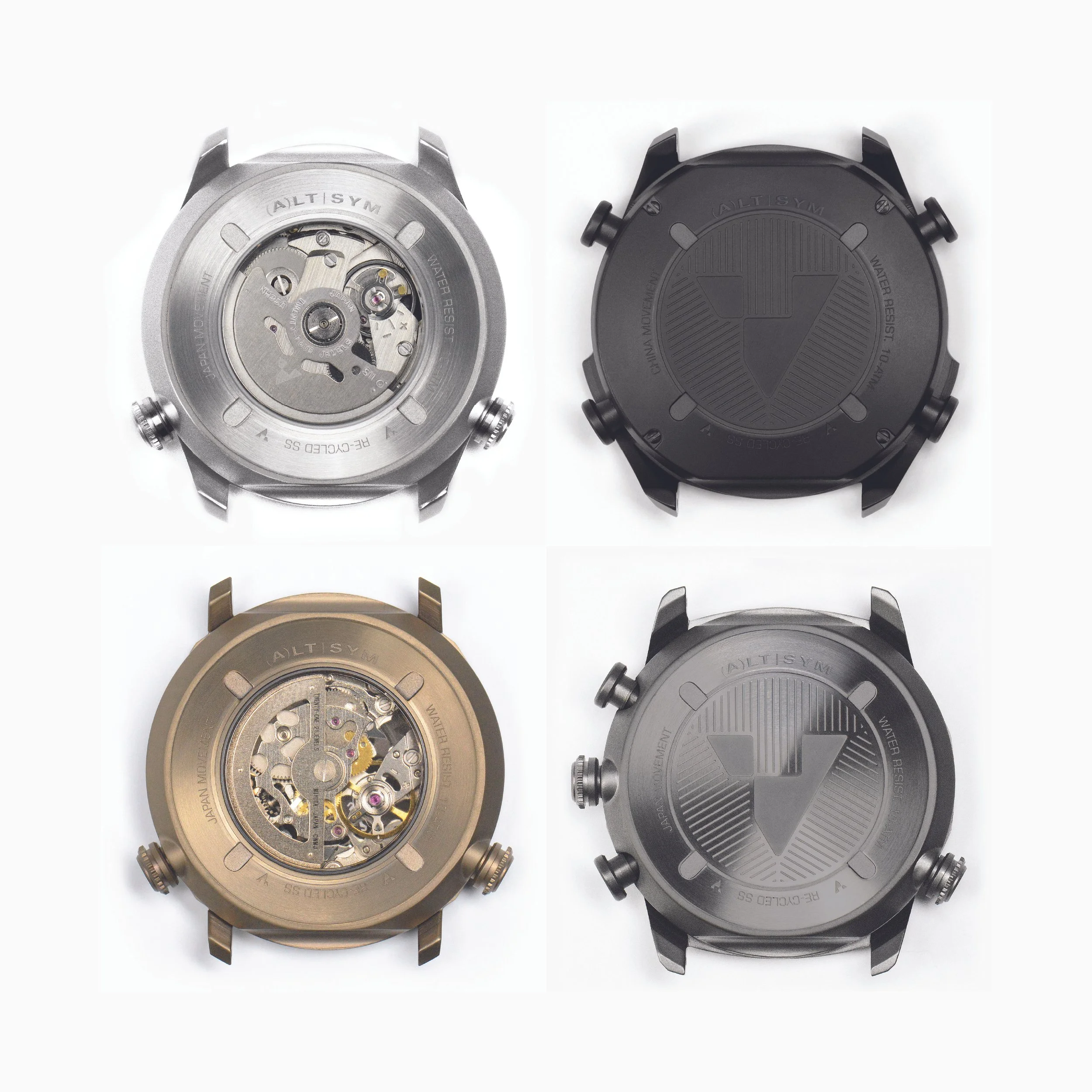
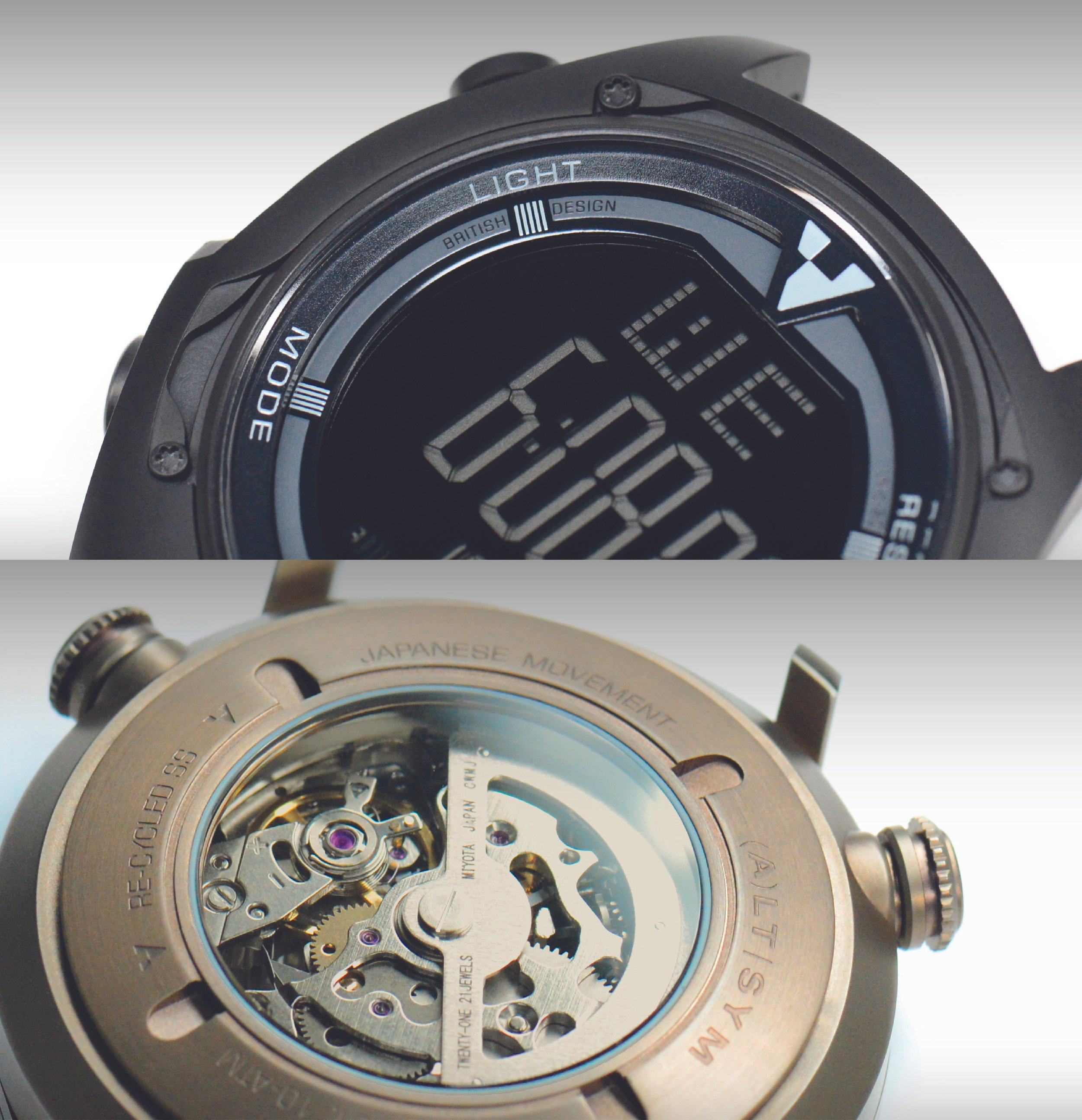
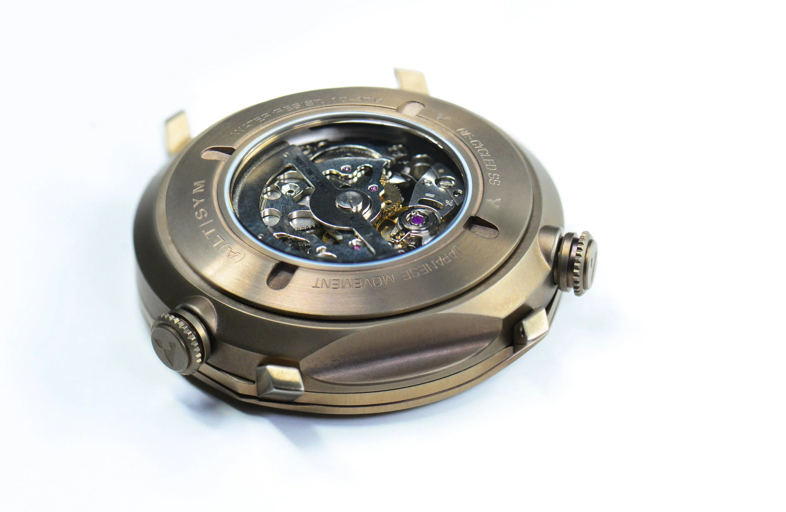
case-backs
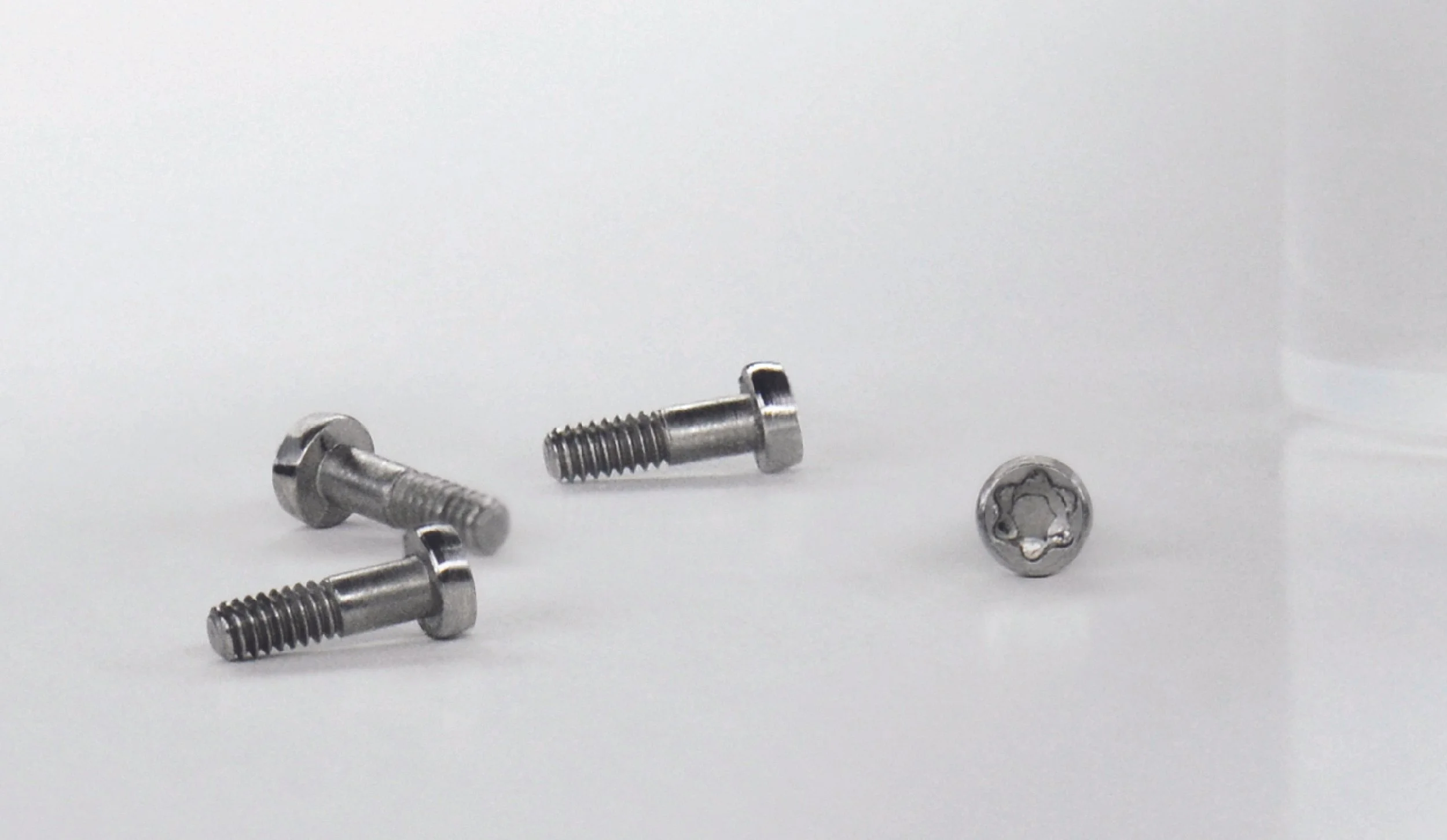
a project packed with integrity and a love for horology that introduces a new approach to symmetry in dial design, within a modular case. It aims to offer true value to the market, with a mindful approach to material choices. Packed with details and character, ALTERNATIVE SYMMETRY features a simple yet effective locking system. It uses four everyday TORX SCREWS, which not only serve a functional purpose but also allow users to transform the watch's appearance, ensuring the screws are more than just decorative
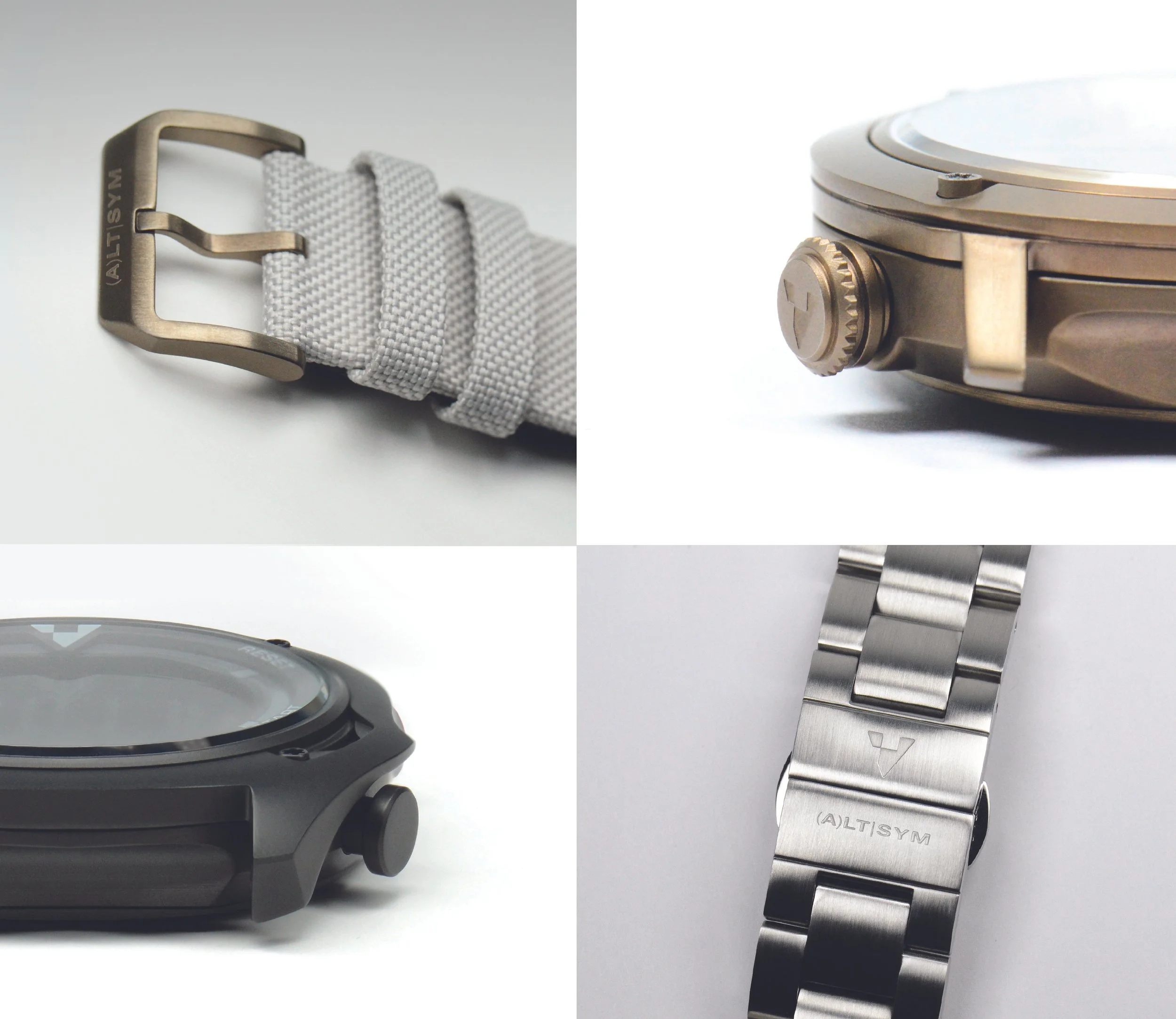
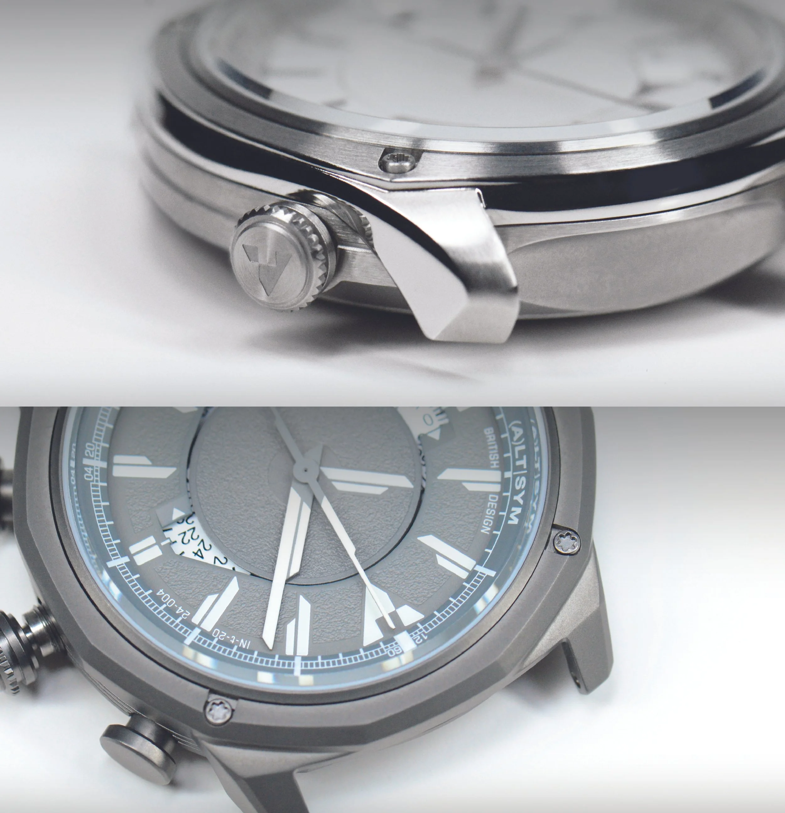
HARDWARE
[ buckles, crowns, pushers & clasps ]
the essential hardware of a watch, such as the crown and buckle [plus clasps & pushers], has been thoughtfully designed to seamlessly complement the dominant MODULE and SURFACE combination. This consideration extends beyond the current collection to all future iterations
subtle design cues were key to our approach. For instance, the crown is crafted for functionality, featuring teeth for easy rotation and a crease for pulling out. Similarly, the buckle is designed for comfort while aligning with overall aesthetic considerations. Each element must harmonize with all upcoming models, whether it be a minimal look, sporty feel, or intricate structure. Our goal is to maintain a strong visual identity while allowing for slight stylistic hardware adjustments if they enhance compatibility with future designs
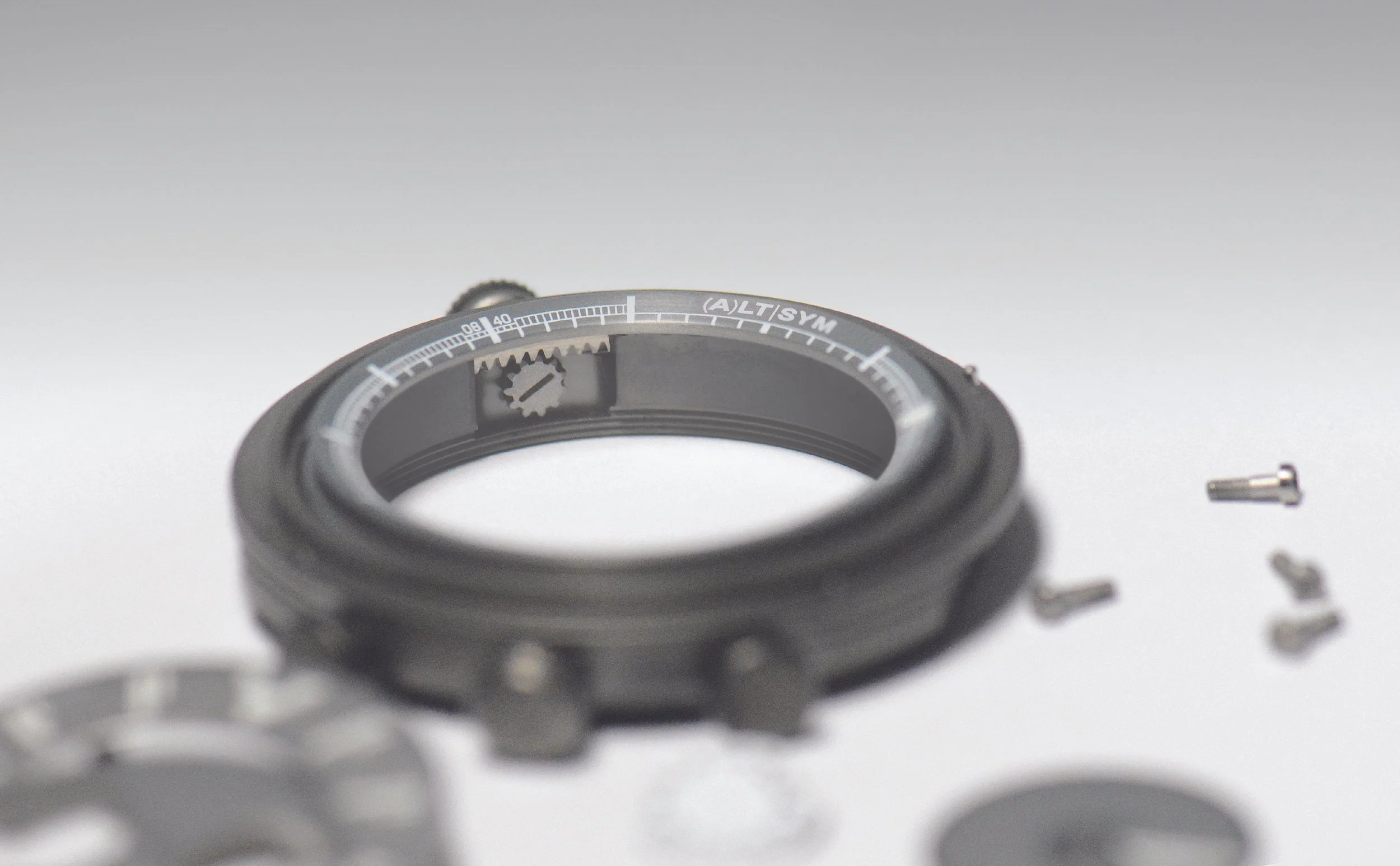
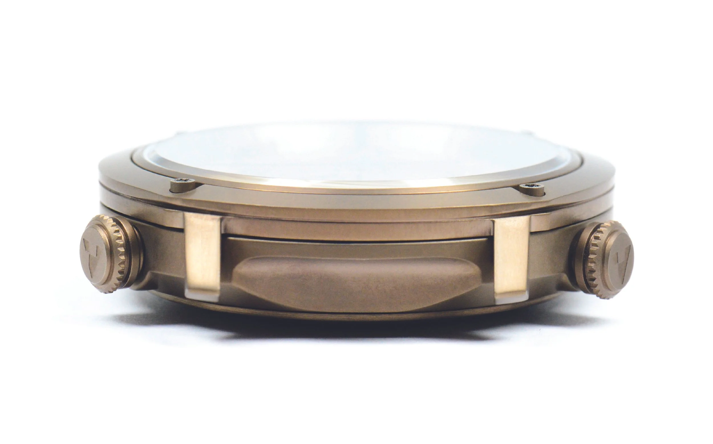
internal rotating bezel
[ as standard ]
whenever possible, each watch will feature an internal rotating bezel. This addition provides extra functions for the user while also creating a distinctive double screw-down crown at the 4 and 8 o’clock positions, along with the other key DNA elements of the disc hour hand, four TORX SCREWS, and the graphic silhouette
key - [DNA]
below are four defining codes that will be used wherever possible going
forward on any new watch design for ALTERNATIVE SYMMETRY:

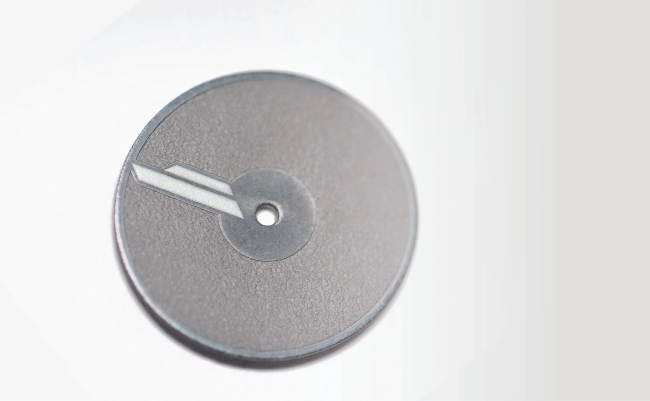
instead of a traditional stick hand, every watch uses a disk to represent the hour indicator. This opens up more creative freedom for future designs while always staying within, or interacting with, the asymmetrical hour marker. It also elevates the dial closer to the crystal, blending into the overall dial design aesthetic and giving stronger contrast to the minute and second hands. The result: better legibility, and a bold, unconventional visual
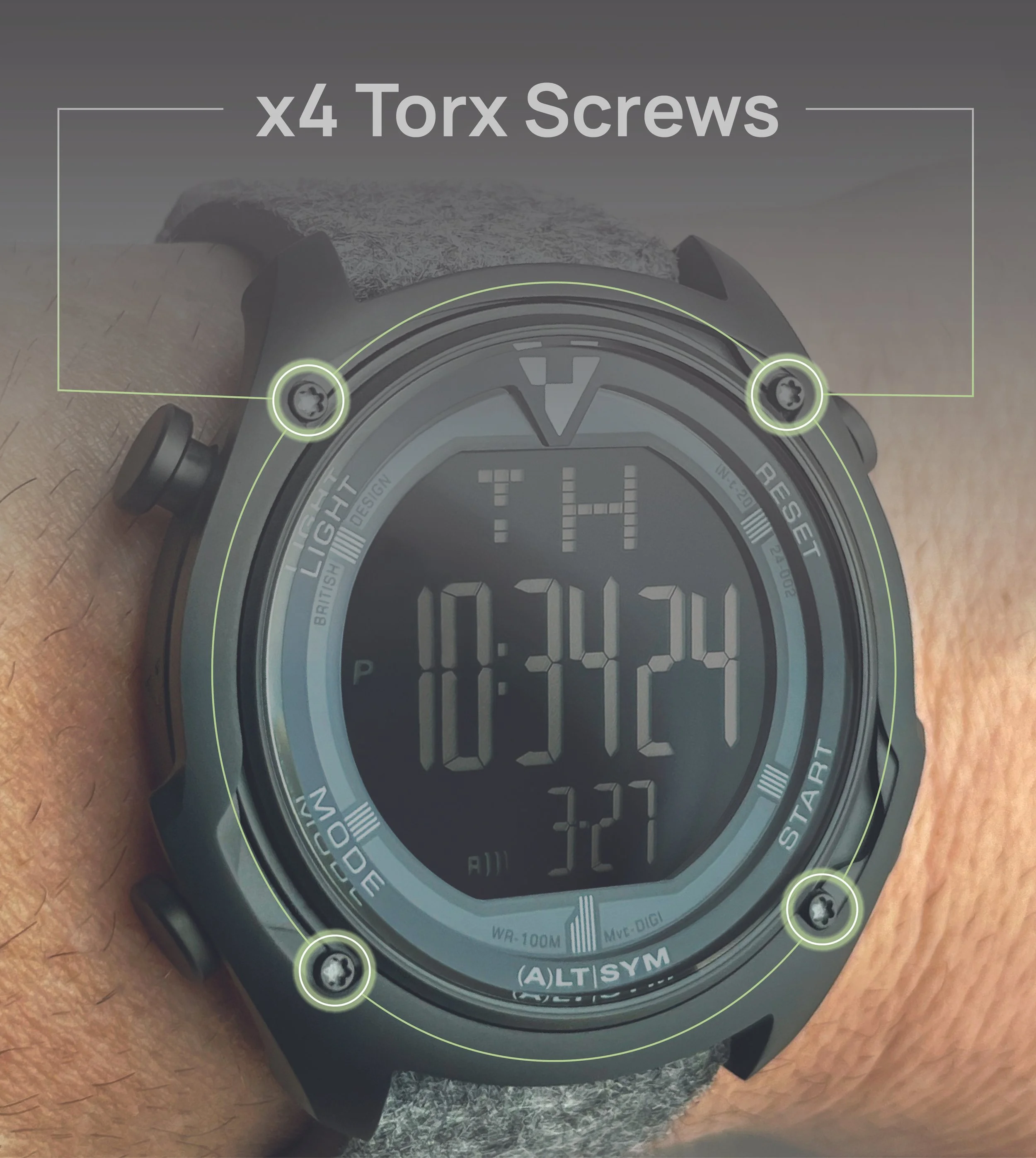
these aren’t just for looks. The signature Torx screws are placed in precise positions to structurally connect components, and they’ll remain in the same locations across all models. Their star-shaped cutouts are functional first, aesthetic second, a deliberate, industrial detail that signals intention, not decoration
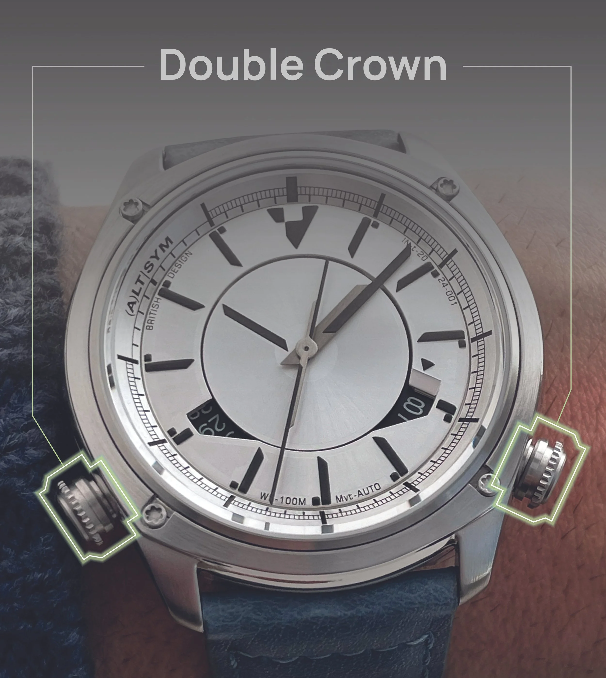
wherever possible, each watch will feature two crowns or similar controls. In this launch collection, one crown operates the movement, the other controls the internal rotating bezel. For the digital model, pushers are placed in the same location to maintain visual consistency. Going forward, expect a functional or aesthetic element to always sit at 4 and 8 o’clock, a defining visual feature that brings symmetry in an unexpected [Alternative] way
framing the disk hour and the minute/second hands is a distinctive, asymmetrical graphic silhouette that acts as a visual signature for the brand. While its exact proportions may shift depending on the movement or layout, the core shape will remain consistent. This detail sets the watches apart from conventional stick hands and uniform index designs, giving each model a unique identity. It’s a bold design element that directly reflects the brand’s name, Alternative Symmetry, and serves as a foundation for future creative exploration. It’s not just a shape; it’s a symbol of the brand’s commitment to doing things a little differently